
Any good designer will tell you; colour has power. It can be used to evoke different moods, tell a story within a home and even bring about a whole new atmosphere. With that said, we realize that establishing a house colour scheme may sound unnerving since it is hard enough to choose a colour scheme for one room alone. Now, you may be wondering, so how could you possibly create a combination that works? Our answer: With our professional guidance.

Go for colours of similar temp:
Colours can largely be bunched into two groups— either warm or cool. Pairing colours with like temperatures result in harmonious colour combinations. For example, pairing cool hues like blues and greens together always works well in creating a relaxing ambience. Alternatively, a mix of warm neutrals such as a light beige with a rich brown creates a welcomingly balmy atmosphere.
Go Monotone:
With Monochromatic palettes, think of tone on tone. It’s a sophisticated look and is almost completely fool proof, even for beginners. Colours within the same hue but slightly different tones. For example, a pale sage green with a deeper green – will always look stunning.

Go with Complementary Colours:
“Opposites attract” is a popular phrase we’re sure you have heard of, and this certainly holds true in term of colour. Opposing colours tend to be complementary and look beautiful when contrasted. For a bold look, try green and red. We promise it won’t look like Christmas.
And if all else fails, a heavy dose of great inspiration can go a long way. Read below for 15 colour combinations in some of our favourite spaces.
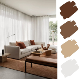
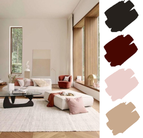
Burnt Sienna + Fawn Brown + Tan + Shell
Soft goods in burnt sienna—such as throw pillows or an area rug, are an effortless and commitment-free way to incorporate a fresh pop of colour into your existing space.

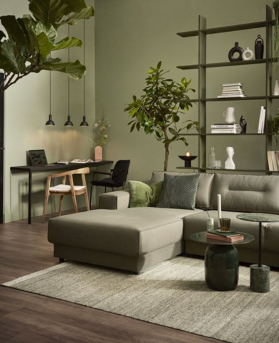
Black + Grey + Olive Green + Haze
The beauty of Olive Green is that they seamlessly combine with the brightest or darkest of colours. In fact, Olive is a great neutral that gives spaces like the dining or living room a sophisticated feel. When blended with other colours, it can still make an impact.
 Sage + Wood + White
 Sage + Wood + White
Apart of being a popular spice in cooking, Sage is a go-to for many designers as a versatile yet dynamic shade throughout classic homes. Isn’t this spot just a perfect example of how just a little can go a long way—especially when paired with the brightest, cleanest of whites and light wood that lets this enduring hue show off.
Brown + Wine Red + Blush Pink + White
Reddish wine hues can create dramatic accents yet add a peaceful look to modern interior decorating. With the richer reds creating a welcoming and balmy atmosphere, the bright, feminine pinks draw us in, the perfect blend of sensuality and romance.
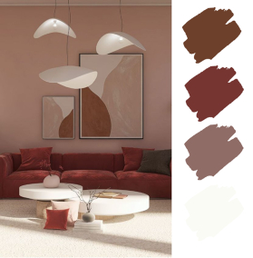
Off Black + Maroon + Blush + Neutrals
 Off Black + Maroon + Blush + Neutrals
In a room full of wood and neutrals, using warm tones as pops of colour make the place more enduring and pleasant to the eye. Warm tones seemingly have the power to liven up just about anywhere and yet doesn’t seem overbearing.
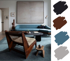
Black + Brown + Beige + Cream
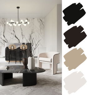 Black + Brown + Beige + Cream
Dark furnishings are bold and add intimacy whilst the pale marble wall as seen is nothing but uplifting. Minimalist yet stylish, doesn’t this just spark the urge to read some books and enjoy a cup of coffee?
Anthracite Grey + Turkish Blue + Gold + White
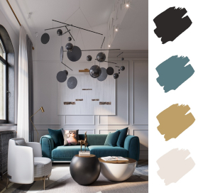 Anthracite Grey + Turkish Blue + Gold + White
There’s just something about paring blue, gold and black that gives off that regal vibe. It highlights the classy shine of gold while complimenting the white’s contrast with black.

Black + Wood + Neutrals
The range of marble never disappoints. With the warm veins of this marble feature paired with a black built in acting as a balance, the room is given a simplistic, homely feeling.
Black + Greige + beige + white
 Black + Greige + beige + white
A new and upcoming colour rising in popularity, Greige. Greige is the unity of grey and beige, each a popular neutral all on their own– but they’ve come together to create the ultimate neutral that goes with just about any colour and design style.
Periwinkle + Cream + Grey
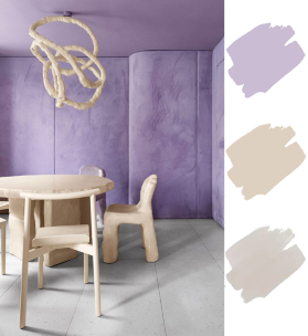 Periwinkle + Cream + Grey
Winking to all purple lovers out there, Periwinkle is a less well-known shade of purple and we can’t stand for it no longer! Encompassing of three main colours, this room emits childlike playfulness and yet remains charismatic to the other end of the age spectrum.
Blues + Fern Green + Pastel yellow + Neutrals
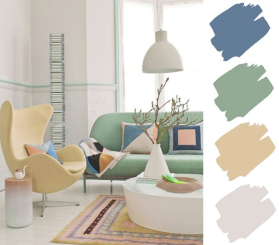 Blues + Fern Green + Pastel yellow + Neutrals
There is something so relaxing about the lighter shades of the colour palette for your spaces that you want to escape from the world in. Don’t shy away from them just because you prefer a more masculine look, remember that pastel colours help to create depth when combining with bolder patterns and colours.
Black + Wood + French Blue + Grey
 Black + Wood + French Blue + Grey
Contemporary vintage. We know it isn’t a known class, but isn’t this in a league of it’s own? The wooden furniture brings about that vintage vibe while the unique French blue seems oh so modern.
Cobalt blue + Sky Blue+ Blush Pink+ Soda Orange
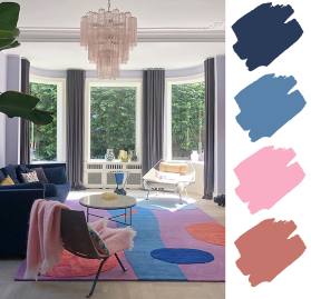 Cobalt blue + Sky Blue+ Blush Pink+ Soda Orange
We can’t seem to get enough of how perfectly this blended cool and warm tones. With neither overpowering the other, it reminded us of the crowd favourite, PB&J, each bringing different flavours and textures yet creating a whole new thing altogether.
Forest Green + Brown + Gold + White
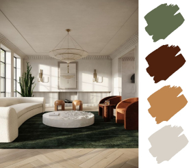 Forest Green + Brown + Gold + White
Plush Green rug, Earthy Brown chairs, subtle Golden Tints. Modern luxury meets the forest spirit. Contemporary interiors are trending these days but why should mother nature’s colours be forgotten? Sometimes, merging can create the best of both worlds.
Black + White
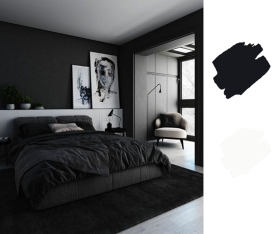 Black + White
Should all else fail, trusty black always will have your back. Black is moody yet easy on the eyes, as a core of many interior designs, it can almost never go wrong. The classic black and white combo can always be your backup plan.
Our houses have so much potential that’s just waiting to be tapped into. With these colour interior design tips, you can elevate your living space, and create a home that looks as good as it feels to be in. To help you reach your ultimate dream home goals, contact us today at +65 63451730, or drop us an email at info@ipoisedesign.com. Feel free to check out more of our articles here.